Jay Shim
stamper
Piggy
Read time:
6 min
Client:
Teenage Engineering
Industry:
Finance
Start:
September 1, 2025
Start:
September 1, 2025
End:
September 26, 2025
End:
September 26, 2025
Duration:
4 Weeks
Duration:
4 Weeks
Piggy’s core objective is to provide users with a centralized dashboard to view all their active subscriptions in one place. The company's goal is to explore features such as users being able to easily unsubscribe from unwanted services and receive timely notifications about upcoming auto-renewals, giving them more control over their spending.


User Research
The target user is around 30 years old, uses both mobile and desktop devices regularly, falls within the middle-class income range, and is focused on being more budget-conscious. To identify participants who closely matched this profile, I began with a screening survey. From this, I selected 10 participants who aligned with the target criteria and they agreed to complete a second, more in-depth quantitative survey focused on subscription behavior.

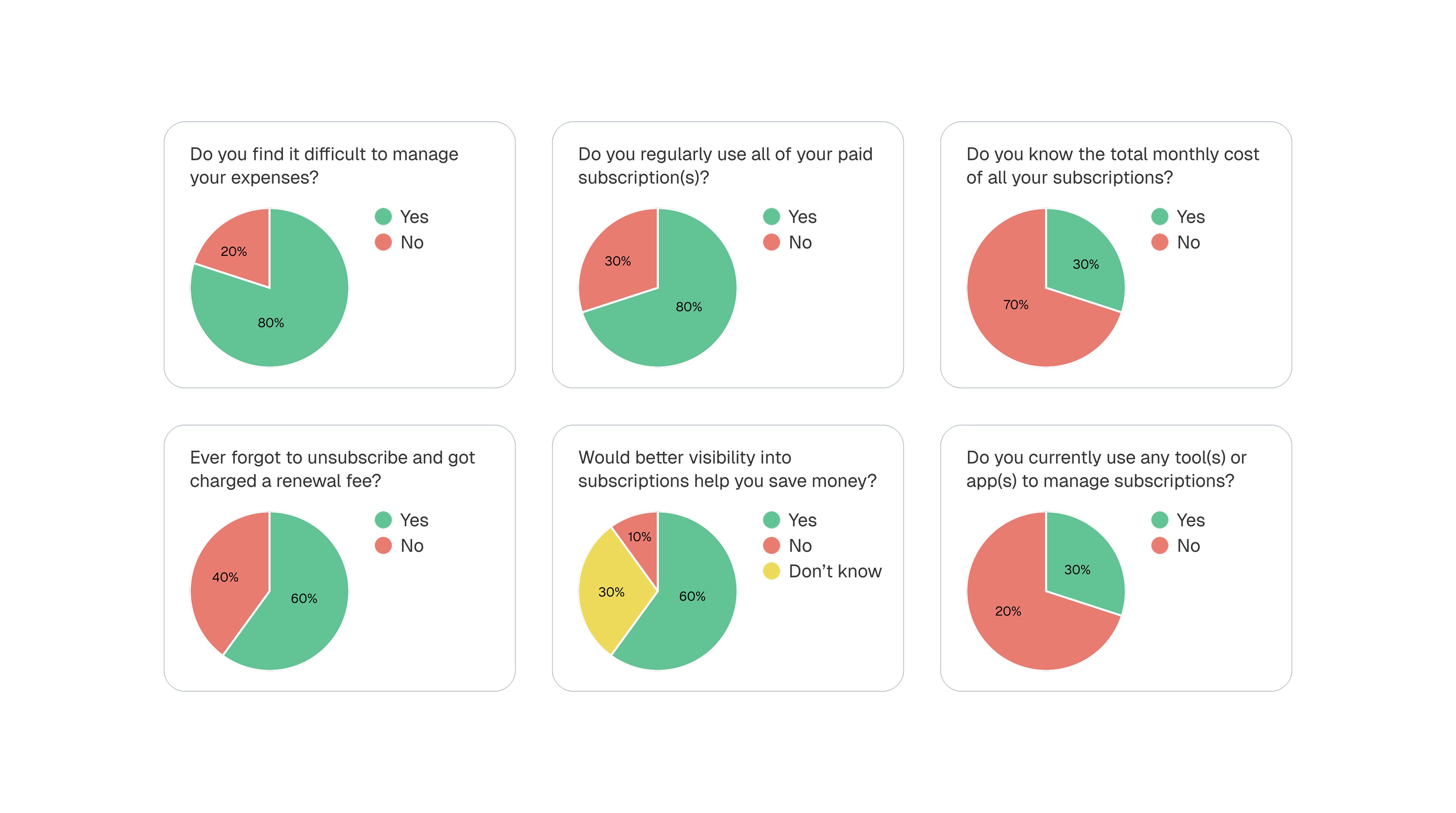
To gather deeper insights, I also created a separate qualitative survey. This survey included 10 participants I selected from the screening test. The qualitative questions were designed to uncover user pain points, needs, and motivations related to managing app subscriptions.

Thematic Analysis
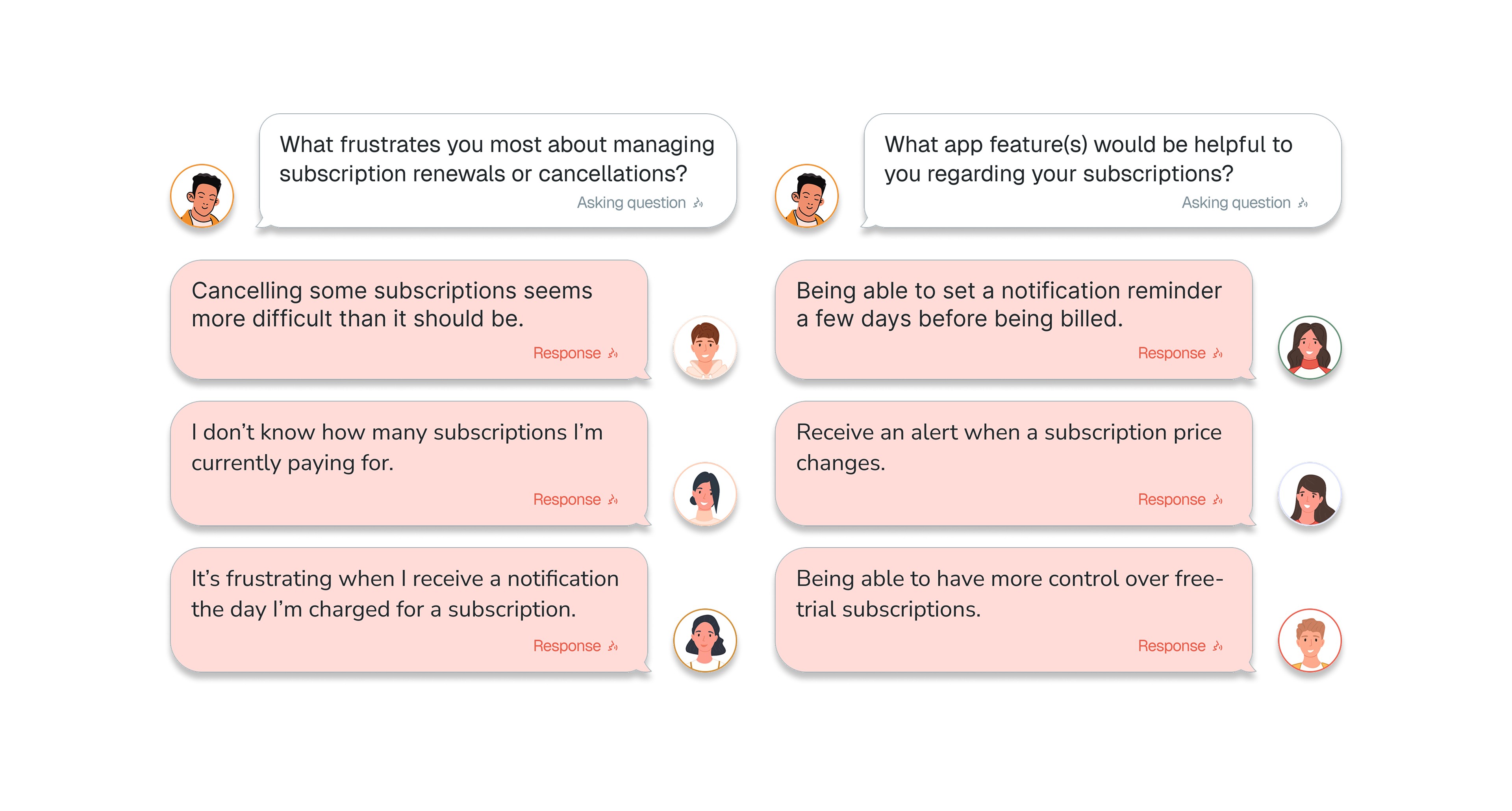
Using the collected quantitative and qualitative data, I synthesized insights through thematic analysis, highlighting key user challenges and needs. Grouping data by themes helped me translate these findings into focused, user-centered design solutions.

Value Proposition
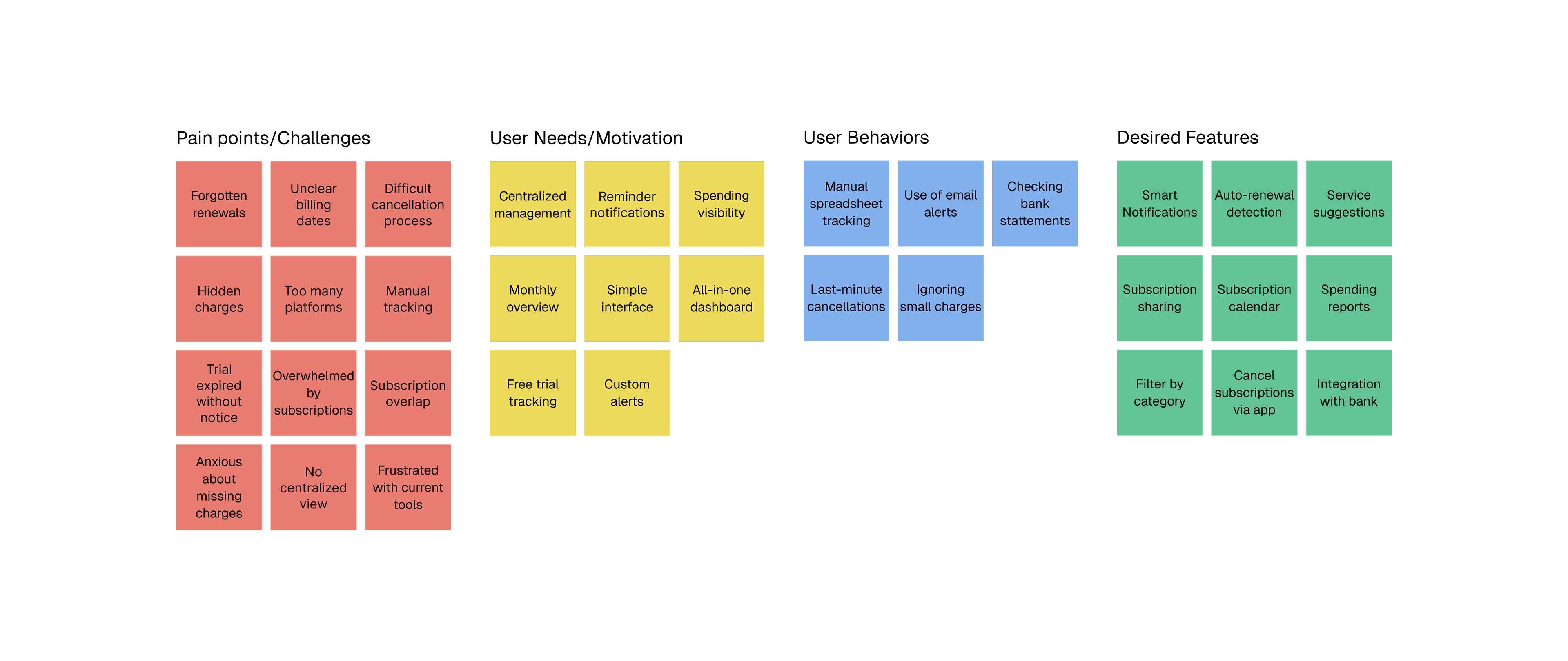
I analyzed competing apps and found that many did not align with the key features my participants wanted or needed. Reviewing these products also helped inform the structure of the app, allowing me to intentionally incorporate user-driven needs and address gaps not met by the existing solutions.

Wireflow
With sufficient insights gathered, I began creating a user flow that incorporated all key features. I focused on designing a clear and efficient wireflow, making the transition into a testable, high-fidelity prototype more seamless.
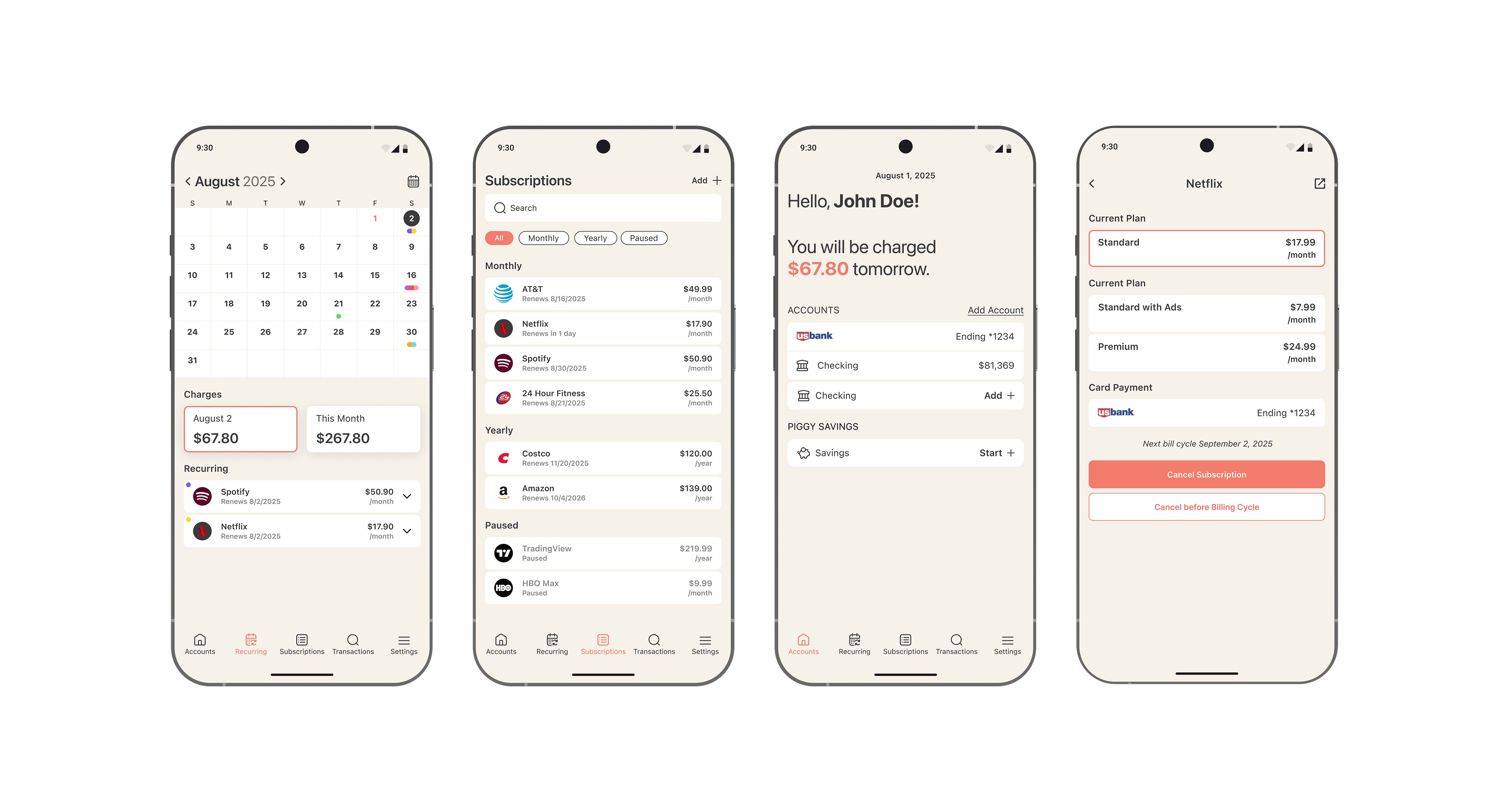
Design Solution: Control over Subscriptions
With user needs as the priority, I designed features that give users full control, including early renewal reminders, autopay with card selection, bill splitting, and subscription cancellation. Bringing all of these actions into a single view helped users feel more in control and made managing subscriptions simple and intuitive.

Design Solution: Control over Price
Users have full visibility and control over their subscription costs through a calendar-based interface. Selecting a specific day reveals the exact charges for that date displayed in a card under charges below, while monthly and yearly views provide a clear breakdown of recurring expenses. Each view details which subscriptions are being charged and when, making it easy to understand spending at a daily, monthly, or annual level.

Design Solution: Splitting Bill
Some users shared that splitting subscriptions can feel uncomfortable, especially when it comes to asking for payment. Piggy simplifies this by allowing users to add another person to a shared bill using their name and phone number. Payment reminders are automatically sent based on the early reminder the user sets. If the other person doesn’t have the Piggy app, they’ll receive an SMS reminder with the option to opt out at any time. If they do have the app, they’ll receive both a text message and an in-app notification. All notification and sharing settings are fully customizable.

Design Solution: Unsubscribing Options
Users noted that they’re often unsure about when to cancel a subscription, especially during free trials or before an upcoming charge. To reduce friction and prevent forgotten cancellations, I included a clear “Cancel before Billing Cycle” CTA, making it easy for users to unsubscribe before being charged.

Key Takeaway
User feedback was the importance of maintaining a simple, intuitive experience. Some elements were more complex than needed, leading to confusion. The feedback reinforced the need to stay focused on the product’s core goal—delivering clear, accessible insights and making subscription management effortless—while refining features to better support user understanding and streamline the overall experience.